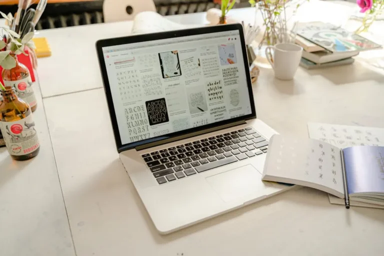
Choosing the right minimalist font for a website extends beyond aesthetic preference; it directly impacts user experience, brand perception, and content legibility. A well-selected minimalist font enhances clarity, reduces visual clutter, and supports faster page load times by often requiring fewer stylistic variations. The goal is to select a typeface that communicates professionalism and modernity without distracting from the core message or product. This decision requires evaluating a font's practical attributes, including its readability across diverse screen sizes, its character set for global reach, and its overall visual consistency with a brand's digital presence.
Key Considerations for Minimalist Website Fonts
When selecting a minimalist font, several technical and design factors warrant close attention to ensure optimal performance and user experience. Prioritizing these elements helps avoid common pitfalls associated with font choices that can hinder site functionality or brand communication.
- Legibility and Readability: A font's primary function is to be read effortlessly. Minimalist fonts excel when they maintain clear letterforms, appropriate character spacing (kerning and tracking), and distinct differentiation between similar characters (e.g., 'l' and 'I', '0' and 'O'). Test fonts at various sizes and on different devices to assess their performance under real-world conditions.
- Versatility and Weights: A strong minimalist font family offers a range of weights (light, regular, medium, bold) and styles (italic) to establish visual hierarchy without introducing additional typefaces. This versatility allows for clear distinction between headings, body text, and calls to action, maintaining a cohesive design language.
- Character Set and Language Support: Websites often serve a global audience. Verify that a chosen font supports the necessary character sets, including extended Latin, Cyrillic, or other scripts relevant to your target markets. Incomplete character sets can lead to inconsistent rendering and a fragmented user experience.
- Web Performance Impact: Each font file adds to a page's total load size. While minimalist fonts often have simpler designs, the number of weights and styles included can still create large file sizes. Optimize font delivery by only loading necessary subsets and formats (e.g., WOFF2) to minimize impact on page speed, a critical SEO factor.
- Licensing and Usage Rights: Understand the licensing terms for any font used commercially. Many high-quality minimalist fonts are available through open-source licenses, while others require commercial licenses, which can vary in cost and usage restrictions. Ensure compliance to avoid legal issues.
- Brand Alignment: Beyond functionality, the chosen font must resonate with the brand's identity. A minimalist font can convey sophistication, innovation, or approachability depending on its specific design nuances. Evaluate how the font's aesthetic contributes to the overall brand message.
1. Open Sans
Open Sans is a highly versatile humanist sans-serif typeface designed by Steve Matteson. Its neutral yet friendly appearance makes it one of the most widely used web fonts. The design prioritizes legibility across print, web, and mobile interfaces, featuring open forms and a large x-height that contribute to its exceptional readability even at small sizes. Its extensive character set supports a broad range of languages, making it a reliable choice for international projects.
Best for: Content-heavy websites, corporate portals, e-commerce, and multilingual platforms requiring robust legibility.
Pros: Excellent readability across all sizes; wide range of weights (light to extra-bold) for hierarchy; extensive character set (897 glyphs) supporting numerous languages; neutral aesthetic that complements various design styles.
Cons: Its widespread use can make a site appear less distinctive; loading many weights can increase page load times if not optimized.
Verdict: A dependable workhorse font that delivers consistent, clear communication without drawing undue attention to itself. Ideal for projects where clarity and broad accessibility are paramount.
2. Montserrat
Montserrat is a geometric sans-serif typeface inspired by old posters and signs from the traditional Montserrat neighborhood of Buenos Aires. Designed by Julieta Ulanovsky, it captures the essence of urban typography from the early 20th century. Its clean lines, strong geometric shapes, and balanced proportions give it a modern yet classic feel, making it suitable for both headlines and body text, especially in digital environments.
Best for: Branding, headlines, modern websites, portfolios, and projects seeking a contemporary urban aesthetic.
Pros: Strong visual presence for headlines; good readability for body text; extensive weight range; captures a distinctive, modern-classic feel.
Cons: Can feel somewhat formal or stiff in very long blocks of text; its geometric precision might lack the warmth of humanist sans-serifs.
Verdict: A robust choice for designers aiming for a clean, architectural look with a subtle nod to historical urban design. Its strength lies in its versatility across various content types.
3. Lato
Designed by Łukasz Dziedzic, Lato is a semi-rounded humanist sans-serif typeface that strikes a balance between warmth and stability. Its transparent design means it is intended to be almost invisible when used in body text, allowing content to take precedence. The slightly rounded details give it a friendly feel, contrasting with the more rigid geometric sans-serifs, while still maintaining high legibility and a minimalist aesthetic.
Best for: Blogs, editorial content, user interfaces, and brands seeking a friendly yet professional tone.
Pros: Excellent readability for long-form content; friendly and approachable feel without sacrificing professionalism; wide array of weights and styles; good language support.
Cons: Its subtle warmth might not suit ultra-strict, purely geometric design requirements; can blend in too much if not paired with a more distinct display font.
Verdict: A highly adaptable font that provides a comfortable reading experience. Lato is particularly effective for sites prioritizing user engagement through accessible and inviting text.
4. Raleway
Raleway is an elegant sans-serif typeface originally designed by Matt McInerney as a single thin weight. It has since been expanded into a full family by Pablo Impallari and Rodrigo Fuenzalida. Known for its sophisticated and clean appearance, Raleway features distinctive uppercase letters and unique ligatures, giving it a refined character suitable for display purposes while also performing well in body text at larger sizes.
Best for: Headlines, branding, fashion websites, portfolios, and luxury product sites where elegance is key.
Pros: Distinctive and elegant appearance; wide range of weights from thin to black; includes unique ligatures that add character; strong visual impact for headings.
Cons: Some of its more decorative elements (like the 'W' and ligatures) can be distracting in dense body text at small sizes; legibility can decrease at very small point sizes.
Verdict: An excellent choice for conveying sophistication and refinement. While versatile, its strength is in larger applications where its unique characteristics can be appreciated without hindering readability.
5. Source Sans Pro
Source Sans Pro is Adobe's first open-source typeface, designed by Paul D. Hunt. It is a humanist sans-serif with a clean, classic aesthetic optimized for user interfaces. Its balanced proportions and generous x-height contribute to its high legibility across a variety of screen resolutions and sizes. The design goal was to create a typeface that performs well in a wide range of contexts, from body text to headlines, with a focus on clarity and neutrality.
Best for: User interfaces, dashboards, technical documentation, corporate websites, and applications requiring consistent, clear typography.
Pros: Excellent legibility for UI and body text; comprehensive character set with broad language support; multiple weights and styles; optimized for digital screens.
Cons: Can be perceived as somewhat generic due to its neutrality and widespread use; lacks a strong unique personality for highly distinctive branding.
Verdict: A highly functional and reliable choice for developers and designers who need a robust, readable, and performance-optimized font for digital environments. It prioritizes clarity above all else.
6. Inter
Inter is a highly versatile font family specifically designed for user interfaces by Rasmus Andersson. It features a tall x-height to aid in readability of mixed-case and lower-case text. The font includes a large number of OpenType features, such as contextual alternates for punctuation and fractions, which enhance its functionality and aesthetic consistency in digital applications. Its meticulous design addresses common UI typography challenges, ensuring crisp rendering and clear distinction between characters.
Best for: Web applications, dashboards, mobile interfaces, and digital products where precise control over typography and high legibility are critical.
Pros: Optimized for UI; excellent legibility at small sizes; extensive OpenType features for fine-tuned typography; broad language support; multiple weights and variable font options.
Cons: Its highly functional, almost utilitarian design might be too stark for brands seeking a softer or more decorative aesthetic; variable font implementation can be complex for some users.
Verdict: A top-tier choice for any digital product where pixel-perfect rendering and user experience are paramount. Its design-first approach to UI typography makes it exceptionally practical.
7. Poppins
Poppins is a geometric sans-serif typeface based on circles and perfect geometry. Designed by the Indian Type Foundry, it features a clean, monolinear structure that gives it a modern and approachable feel. Its consistent stroke width and open forms contribute to its clarity, making it suitable for both display and body text, particularly in digital contexts where a contemporary aesthetic is desired.
Best for: Modern web design, tech startups, educational platforms, and brands aiming for a friendly yet structured appearance.
Pros: Clean, modern, and friendly aesthetic; good legibility for both headings and body text; extensive weight range; strong visual consistency due to its geometric basis.
Cons: Can feel somewhat repetitive in very long blocks of text due to its geometric uniformity; might lack the organic flow preferred for highly editorial content.
Verdict: A solid option for projects that benefit from a clean, geometric structure and a contemporary feel. Its versatility makes it a strong contender for a primary typeface.
8. Roboto
Roboto is Google's default font for the Android operating system and is widely used across its services. It is a neo-grotesque sans-serif typeface that Google describes as having a "mechanical skeleton with a friendly touch." This duality gives it a modern, clean appearance while maintaining a natural reading rhythm. It features open curves and a wide range of weights, making it highly adaptable for various applications, from headlines to small print.
Best for: Mobile-first websites, Android-centric applications, tech-oriented brands, and any project needing a familiar, highly optimized web font.
Pros: Highly optimized for digital screens; extensive family with numerous weights and styles (including condensed); excellent legibility; familiar to many users due to its widespread use.
Cons: Its ubiquitous presence can make it feel less unique; the "mechanical" aspect might not suit brands seeking a more organic or humanist feel.
Verdict: A highly reliable and performant font, particularly for projects targeting a broad digital audience. Its familiarity and optimization make it a safe and effective choice for clarity.
9. PT Sans
PT Sans is a humanist sans-serif typeface developed for the Public Type Project by ParaType. It was designed to support the languages of the Russian Federation, making it one of the few open-source fonts with comprehensive Cyrillic support. Its open forms and clear structure ensure high legibility, while its slightly informal yet professional character makes it adaptable for both official and casual communication.
Best for: International websites, educational institutions, government portals, and any project requiring extensive Cyrillic or broad language support.
Pros: Excellent legibility; comprehensive Cyrillic and Latin character sets; available in various weights and styles; balances professionalism with approachability.
Cons: Its specific design history might give it a slightly less 'universal' aesthetic compared to purely Western-centric designs; can appear somewhat conventional.
Verdict: An outstanding choice for projects with a global audience, especially those needing robust Cyrillic support. Its blend of clarity and cultural inclusivity is a significant asset.
10. Fira Sans
Fira Sans is a humanist sans-serif typeface designed by Erik Spiekermann, Ralph du Carrois, and Anja Meiners for Mozilla. It was created to be highly readable on screens, especially for small text, and serves as the official font of the Firefox OS. Its design emphasizes clarity, with generous proportions and distinct letterforms that maintain legibility even in challenging digital environments. The large x-height and open apertures contribute to its excellent performance in user interfaces.
Best for: Technical documentation, open-source projects, web applications, and any platform prioritizing clear, concise information delivery.
Pros: Exceptionally clear and legible, especially at small sizes; comprehensive range of weights and styles; robust language support; optimized for screen rendering.
Cons: Its functional design might be perceived as lacking a strong unique personality for highly stylized branding; can appear somewhat utilitarian.
Verdict: A highly performant and reliable font for digital platforms where information density and small-text legibility are critical. Its functional design ensures content clarity.
11. Ubuntu
The Ubuntu Font Family is a humanist sans-serif typeface designed by Dalton Maag for the Ubuntu operating system. It features unique characteristics in its letterforms, such as the curved stems and open bowls, which give it a distinctive yet friendly appearance. Designed to be modern and professional, it maintains high legibility across various sizes and resolutions, reflecting the operating system's emphasis on user experience.
Best for: Tech blogs, open-source communities, software interfaces, and brands aiming for a modern, approachable, and slightly distinctive tech aesthetic.
Pros: Unique and friendly humanist design; good legibility across sizes; extensive character set with broad language support; conveys a modern, community-oriented feel.
Cons: Its distinctive character might not be universally suitable for all minimalist aesthetics; some letterforms (like the 'u' and 'n') are quite specific, potentially affecting complete neutrality.
Verdict: A strong choice for brands that want a minimalist font with a subtle personality and a connection to modern technology and open-source values. It balances readability with a unique touch.
12. Nunito Sans
Nunito Sans is a well-balanced sans-serif typeface with rounded terminals, designed by Vernon Adams. It is a versatile font that combines the clean lines of a geometric sans-serif with a friendly, approachable feel due to its rounded edges. This makes it highly legible and pleasant to read, suitable for both display and body text. Its extensive weight range allows for flexible typographic hierarchy.
Best for: Educational websites, children's content, lifestyle blogs, and brands that want a soft, friendly, and clean minimalist aesthetic.
Pros: Friendly and approachable due to rounded edges; excellent legibility for both headings and body text; wide range of weights; clean and modern appearance.
Cons: The rounded terminals might be too soft for brands requiring a very sharp or strictly geometric aesthetic; can appear less formal than other sans-serifs.
Verdict: An excellent option for projects seeking a minimalist font that feels inviting and accessible without sacrificing clarity. Its rounded design offers a softer alternative to more rigid geometric typefaces.
Measuring Font Effectiveness and Choosing the Right Fit
Beyond initial selection, the effectiveness of a minimalist font on a website can be quantified through various user experience and performance metrics. Monitor bounce rates and average session duration: if users consistently leave pages quickly or spend less time engaging with content, poor readability could be a contributing factor. Conduct A/B tests with different font pairings or sizes to observe their impact on conversion rates for calls to action or form submissions. User feedback, gathered through surveys or usability testing, provides qualitative insights into readability perceptions and overall aesthetic appeal. Tools that analyze page load speed can confirm that font files are not unduly impacting performance. The "right fit" is ultimately a font that supports brand identity, ensures optimal legibility for the target audience, and contributes positively to technical performance metrics, rather than merely looking good in isolation.
Frequently Asked Questions About Minimalist Fonts for Websites
What defines a minimalist font for web use?
A minimalist font for web use is characterized by clean lines, simple letterforms, and an absence of excessive ornamentation. It prioritizes legibility, readability, and neutrality, aiming to support content without drawing undue attention to the typography itself. These fonts often feature consistent stroke widths, balanced proportions, and a focus on functional design.
Are free minimalist fonts suitable for commercial websites?
Many high-quality minimalist fonts are available under open-source licenses (like the SIL Open Font License), making them suitable for commercial use without direct cost. However, always verify the specific license for each font to ensure it permits commercial application and any modifications you might consider. Reputable sources often provide clear licensing information.
How do minimalist fonts impact website performance and SEO?
Minimalist fonts, by their nature, often have simpler designs, which can translate to smaller file sizes compared to more complex or decorative fonts. Smaller font files contribute to faster page load times, which is a significant factor in SEO and user experience. Proper font optimization, such as using WOFF2 format and subsetting, further enhances this benefit. Readability, a direct outcome of good font choice, also indirectly supports SEO by improving user engagement metrics like time on page.
How many fonts should I use on a minimalist website?
For a minimalist website, it is generally recommended to use one to two font families. Using a single versatile font family with multiple weights and styles often suffices for creating visual hierarchy. If a second font is introduced, it should complement the primary font without competing with it, typically serving a specific purpose like display headings or a distinct call-to-action element. Limiting font count helps maintain a clean aesthetic and reduces page load times.