
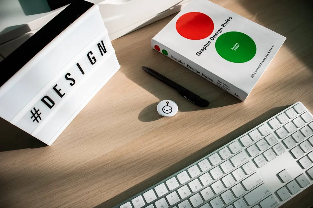
The design principle of unity ensures all visual elements within a composition work together harmoniously, creating a cohesive and visually integrated whole. For any commercial endeavor, from a website interface to a marketing brochure, achieving unity is not merely an aesthetic choice; it is a strategic imperative. A unified design communicates professionalism, reinforces brand identity, and significantly enhances user experience, ultimately influencing conversion rates and customer trust. Without unity, a design risks appearing fragmented, confusing, and amateurish, forcing the audience to expend unnecessary cognitive effort to process information. This directly impacts how effectively a message is conveyed and how positively a brand is perceived.
Understanding the Core of Design Unity
Design unity refers to the sense that all parts of a design belong together. It's the visual and conceptual coherence that prevents a composition from looking like a random collection of disparate elements. When unity is achieved, the individual components—colors, shapes, lines, typography, images, and spacing—blend seamlessly to support a single, overarching message or purpose. This principle is fundamental because the human brain naturally seeks order and meaning; a unified design provides this order, making information more digestible and engaging.
Conversely, a lack of unity results in visual clutter and cognitive dissonance. Elements might compete for attention, leading to a confusing hierarchy and an inability for the viewer to quickly grasp the intended message. This fragmentation can manifest as inconsistent branding, disjointed layouts, or a general feeling of disorganization, all of which erode credibility and user confidence.
Essential Elements Cultivating Design Unity
Achieving unity is a deliberate process, relying on the thoughtful application of several key design elements. These components, when used consistently and intentionally, guide the viewer's eye and reinforce the overall structure:
Proximity
Grouping related items visually signals their connection. Placing elements closer together suggests they are part of the same unit or convey a similar message. For instance, a product image, its description, and an "Add to Cart" button are typically grouped closely to form a single, actionable component on an e-commerce page.
Repetition
Consistent use of visual elements throughout a design establishes familiarity and rhythm. This includes repeating colors, shapes, textures, font styles, and even spacing patterns. A brand's consistent color palette across all its digital and print assets, or the recurring use of a specific icon style, are prime examples of repetition fostering unity. Consistent visual elements also aid in creating visually consistent graphics across different platforms.
Alignment
Arranging elements along common lines or edges creates a clean, organized appearance. Whether left-aligned text blocks, centered headings, or elements aligned to a grid, alignment provides invisible structural integrity. Misaligned elements immediately disrupt unity, making a design appear sloppy and unprofessional.
Continuity
Continuity refers to the smooth flow or transition between design elements. This can be achieved through lines, shapes, or patterns that lead the eye from one point to another. In web design, consistent navigation menus and logical content progression contribute to a continuous and intuitive user journey.
Similarity and Contrast
While often seen as opposites, both similarity and controlled contrast contribute to unity. Similarity (e.g., using similar button styles) inherently creates cohesion. Contrast, when applied strategically, can highlight important elements without breaking overall unity. For example, a single, bold call-to-action button against a more subdued background draws attention effectively within an otherwise unified layout, rather than appearing as an outlier.
Pro Tip: While unity aims for cohesion, avoid excessive uniformity. A design that is too unified can become monotonous and fail to capture attention where needed. Strategic use of contrast—for example, a distinct headline font or a brightly colored button—can guide the user's eye and emphasize key information without sacrificing overall harmony. The goal is a balanced composition where all elements feel connected, but important details still stand out.
Practical Applications for Cohesive Design
The principle of unity is not abstract; its application directly impacts commercial outcomes across various design disciplines:
- Web and User Interface (UI) Design: Consistent navigation patterns, uniform button styles, and predictable content block layouts reduce cognitive load. Users can quickly understand how to interact with the interface, leading to smoother journeys and higher engagement rates. A unified UI feels intuitive, fostering trust and encouraging exploration.
- Brand Identity and Marketing Materials: A brand's visual identity—logo, color palette, typography, imagery—must be applied consistently across all touchpoints, from social media posts to print advertisements. This repetition builds brand recognition and reinforces core values, making the brand instantly identifiable and trustworthy.
- Content Design: Even within a single article or report, unity ensures readability. Consistent heading styles, paragraph spacing, image treatment, and callout box designs help readers navigate complex information effortlessly. This structured presentation makes content more credible and easier to absorb.
- Product Design: Physical products benefit from unity in form, function, and material. A unified design language across a product line makes individual products recognizable as part of a larger family, enhancing brand loyalty and perceived quality.
Ensuring Cohesion in Your Projects
Implementing unity effectively requires a disciplined approach. Consider these strategies:
Develop a comprehensive style guide: Document all visual elements, including color codes, font families and sizes, spacing rules, icon usage, and image treatment. This serves as a single source of truth for all design decisions.
Utilize grid systems: Grids provide a foundational structure for consistent alignment and spacing, ensuring elements are positioned purposefully rather than arbitrarily. This creates order and visual balance.
Limit visual variables: Restrict the number of colors, fonts, and graphic styles used. Fewer variables make it easier to maintain consistency and prevent visual chaos.
Conduct regular visual audits: Periodically review designs across different platforms and materials to identify inconsistencies or areas where unity is breaking down. This proactive approach helps maintain a cohesive brand presence.
Implementing Unified Design Principles
Achieving design unity is an iterative process, not a one-time task. It requires continuous attention to detail and a commitment to consistency across all visual communications. By prioritizing unity, designers and marketers can create experiences that are not only aesthetically pleasing but also highly functional, intuitive, and effective in achieving commercial objectives. A unified design speaks to professionalism, builds trust, and ultimately drives positive user interactions, making it an indispensable principle for any successful visual communication strategy.
Frequently Asked Questions
What is the primary goal of unity in design?
The primary goal of unity in design is to create a cohesive and harmonious composition where all elements appear to belong together, fostering clarity, professionalism, and effective communication of the intended message.
Can a design be unified but still appear monotonous?
Yes, a design can be overly unified to the point of monotony if there isn't enough strategic contrast or variation to maintain visual interest and guide the viewer's eye to important elements. Effective unity balances cohesion with necessary differentiation.
How does unity relate to visual hierarchy?
Unity supports visual hierarchy by ensuring that while elements are cohesive, key information is still emphasized and easily discernible. A unified design provides a clear framework within which hierarchical elements can effectively guide the user's attention without appearing disjointed.
What's the quickest way to check for unity in a design?
A quick check for unity involves squinting at the design or stepping back from it. If the composition appears as a coherent whole rather than a collection of separate parts, and if your eye flows smoothly across the elements, unity is likely present.



