
Designing an effective newsletter extends beyond visual aesthetics; it requires a strategic approach to structure, content, and technical execution to drive subscriber engagement and achieve specific commercial objectives. A poorly designed newsletter, regardless of its content, risks low open rates, high unsubscribe rates, and a failure to convert interest into action. Conversely, a well-crafted newsletter reinforces brand identity, communicates value efficiently, and guides recipients toward desired outcomes, whether that's a purchase, a content download, or community participation. This guide outlines the core principles and practical steps for designing newsletters that resonate with your audience and deliver measurable results.
Establishing Core Design Principles
Successful newsletter design begins with foundational principles that ensure clarity, impact, and a positive user experience across various platforms.
Prioritizing Readability and Visual Hierarchy
Readability dictates how easily subscribers can consume your content. This involves careful selection of typography, adequate line spacing, and strategic use of white space. A clear visual hierarchy guides the reader's eye through the most important information first, ensuring key messages and calls to action are not overlooked.
- Font Selection: Opt for web-safe fonts or embed custom fonts that are legible at various sizes. Limit font families to two or three for consistency.
- Line Height & Letter Spacing: Ensure sufficient line height (1.4-1.6 times font size) and appropriate letter spacing to prevent text from appearing cramped.
- White Space: Utilize ample white space around text blocks, images, and CTAs to reduce cognitive load and improve focus.
- Heading Structure: Employ distinct heading styles (H2, H3) to break up content and signal topic shifts.
Ensuring Brand Consistency
Your newsletter is an extension of your brand. Maintaining consistent branding elements across all communications reinforces recognition and builds trust. This includes your logo, color palette, imagery, and brand voice.
Key Elements:
- Logo Placement: Prominently display your logo in the header.
- Color Palette: Use your brand's primary and secondary colors strategically to highlight important sections and maintain visual identity.
- Imagery Style: Select images and graphics that align with your brand's aesthetic and message. Avoid generic stock photos if your brand has a distinct visual language.
- Tone of Voice: Ensure the copy reflects your established brand voice, whether it's formal, casual, authoritative, or playful.
Designing for Mobile Responsiveness
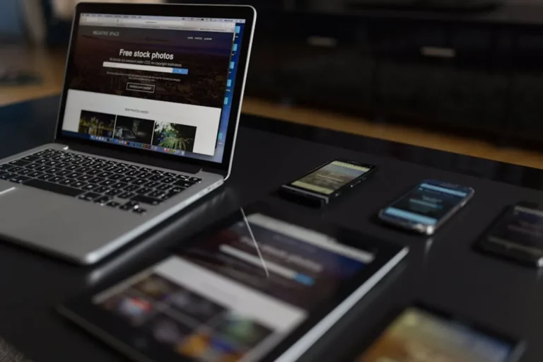
A significant portion of email opens occur on mobile devices. A non-responsive design leads to a frustrating experience, requiring pinching and zooming, which often results in immediate deletion. Responsive design ensures your newsletter adapts seamlessly to different screen sizes.
Implementation:
- Single-Column Layouts: Prefer single-column layouts for mobile to simplify content flow.
- Scalable Images: Use CSS to ensure images scale down appropriately without distorting.
- Tap-Friendly CTAs: Buttons should be large enough (at least 44x44 pixels) and have sufficient padding to be easily tappable.
- Font Sizes: Maintain legible font sizes on mobile (e.g., 14-16px for body text, larger for headings).
Structuring Your Newsletter for Impact
The layout and flow of your newsletter dictate how easily subscribers can digest information and act on it. A logical structure guides them through your message.
The Essential Header and Preheader
The header is the first impression. It typically contains your logo and, sometimes, a link to view the email in a browser. The preheader text, visible in the inbox preview, is a critical opportunity to entice opens.
Header Best Practices:
- Clear Logo: High-resolution, appropriately sized.
- "View in Browser" Link: Essential for rendering issues or accessibility.
Preheader Optimization:
- Concise Summary: Summarize the email's main benefit or content.
- Call to Action: Occasionally include a short, compelling CTA.
- Personalization: Incorporate subscriber names or relevant data when possible.
Crafting an Engaging Hero Section
The hero section is the primary visual area immediately below the header. It should capture attention and convey the newsletter's main purpose or most important offer.
Elements:
- Compelling Headline: Clear, benefit-driven, and concise.
- Primary Image/Graphic: High-quality, relevant, and visually striking.
- Main Call to Action (CTA): Prominently placed, action-oriented, and distinct from surrounding text.
- Concise Copy: A brief paragraph explaining the value proposition.
Developing Effective Content Blocks
Content blocks organize the body of your newsletter, presenting various articles, product updates, or announcements. Each block should be self-contained but contribute to the overall narrative.
Design Considerations:
- Modular Design: Use repeatable modules for different content types (e.g., article preview, product spotlight, event announcement).
- Clear CTAs: Each content block should ideally have its own relevant call to action.
- Scannable Format: Use bullet points, bold text, and short paragraphs to make content easy to skim.
The Strategic Footer
The footer provides necessary legal information, contact details, and options for subscribers to manage their preferences or unsubscribe. It's also an opportunity to include social media links.
Required Elements:
- Unsubscribe Link: Clear and easy to find, per anti-spam regulations.
- Physical Address: Required by CAN-SPAM Act and GDPR.
- Copyright Notice: Protects your content.
Optional Additions:
- Social Media Links: Expand your reach.
- Preference Center Link: Allows subscribers to tailor their email experience.
- Link to Website: Additional navigation.
Pro Tip: Always test your newsletter across multiple email clients (Gmail, Outlook, Apple Mail) and devices before sending. Tools like Litmus or Email on Acid provide simulations and actual renders, revealing rendering inconsistencies that can impact user experience and deliverability. Pay particular attention to image blocking, font fallback, and CTA button rendering.
Optimizing Content and Visuals
Beyond structure, the actual content and visual assets within your newsletter determine its effectiveness.
Image Optimization and Usage
Images enhance visual appeal but can also hinder deliverability and load times if not optimized.
- File Size: Compress images to minimize file size without compromising quality. Aim for under 100KB per image.
- Alt Text: Provide descriptive alt text for all images. This is crucial for accessibility and when images are blocked by email clients.
- Relevance: Ensure all images directly support the accompanying text and add value.
Balancing Text-to-Image Ratio
A high image-to-text ratio can trigger spam filters, while too much text without visual breaks can be overwhelming. A balanced approach is key.
Guidance:
- Ideal Ratio: Aim for a ratio where text accounts for at least 60-70% of the email content.
- Deliverability: Email service providers often flag emails with excessive images and minimal text as potentially spammy.
- Accessibility: Text is readable by screen readers; images without alt text are not.
Integrating Personalization and Dynamic Content
Personalization moves beyond simply addressing subscribers by name. Dynamic content allows you to display different content blocks based on subscriber segments, past behavior, or preferences, making the newsletter highly relevant.
Examples:
- Product recommendations based on browsing history.
- Geographically targeted event announcements.
- Content tailored to specific subscriber interests.
Ensuring Technical Compatibility and Accessibility
A well-designed newsletter is also technically sound and accessible to all users.
Email Client Compatibility
Email clients interpret HTML and CSS differently. What looks perfect in one client might break in another. Use robust, email-specific HTML and CSS, often relying on older, more widely supported standards.
Techniques:
- Inline CSS: Often necessary for consistent styling across clients.
- HTML Tables: Frequently used for layout structure due to broad support.
- Conditional Comments: For Outlook-specific rendering issues.
Accessibility Standards
Designing for accessibility ensures your newsletter is usable by individuals with disabilities, including those using screen readers or having color vision deficiencies.
Practices:
- Color Contrast: Ensure sufficient contrast between text and background colors.
- Semantic HTML: Use appropriate HTML tags where possible.
- Logical Reading Order: Ensure the content flows logically for screen readers.
- Descriptive Links: Avoid "click here"; use descriptive link text.
Refining Your Newsletter Design for Performance
Effective newsletter design is an iterative process. Continuously analyze performance metrics and refine your approach.
Focus on A/B testing different design elements: CTA button colors, image choices, layout variations, and headline styles. Monitor open rates, click-through rates, and conversion metrics to understand what resonates most with your audience. Regularly solicit feedback through surveys or direct interaction to uncover pain points or preferences. The goal is to evolve your design based on data-driven insights, ensuring your newsletters consistently deliver value and achieve commercial objectives.
Frequently Asked Questions About Newsletter Design
What is the ideal length for a newsletter?
The ideal length varies by audience and content type. Generally, shorter, more scannable newsletters with clear calls to action perform better. For content-heavy newsletters, use summaries and links to full articles rather than including entire pieces within the email.
Should I use images or stick to text-only emails?
A balanced approach is best. Images enhance visual appeal and break up text, improving engagement. However, too many images can increase load times, trigger spam filters, and be inaccessible if not properly optimized with alt text. Aim for a healthy text-to-image ratio.
How often should I send my newsletter?
Frequency depends on your content availability and audience expectations. Consistency is more important than sheer volume. Test different frequencies (weekly, bi-weekly, monthly) and monitor open and unsubscribe rates to find the optimal schedule that keeps your audience engaged without overwhelming them.
What are the most common design mistakes to avoid?
Common mistakes include neglecting mobile responsiveness, using too much text without visual breaks, unclear or multiple calls to action, inconsistent branding, and failing to test across various email clients. Overly complex layouts and excessive use of custom fonts that don't render correctly can also detract from the user experience.