
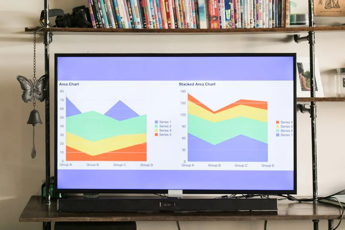
Designing effective charts for blog posts extends beyond mere visual appeal; it directly impacts reader comprehension, information retention, and the perceived authority of your content. A well-designed chart can break down complex data into digestible insights, transforming abstract numbers into compelling narratives. For SEO professionals, marketers, and content creators, integrating charts strategically can enhance user engagement signals, improve dwell time, and increase the likelihood of content being shared or cited, contributing to stronger backlink profiles and organic visibility.
Understanding Your Data and Audience Before Design
Before selecting a chart type or opening design software, critically evaluate the data you intend to visualize and the specific audience you are addressing. Data characteristics, such as whether it's categorical, temporal, or relational, dictate appropriate visualization methods. Your audience's technical proficiency and the context of your blog post will influence the level of detail and complexity you can present. A chart for a beginner's guide requires more explicit labeling and simpler comparisons than one for an expert-level industry report.
- Identify the core message: What single insight or comparison do you want the reader to grasp immediately?
- Assess data type: Is it quantitative (numerical), qualitative (descriptive), categorical (grouped), or temporal (time-based)?
- Consider audience knowledge: Will they understand industry-specific jargon or require more universal terms?
- Determine data scale: Are you comparing small differences or large magnitudes? This affects axis choices.
Choosing the Right Chart Type for Clarity
Selecting an appropriate chart type is fundamental to conveying your data accurately and efficiently. Misusing a chart type can distort information or confuse readers, undermining your post's credibility.
Bar Charts
Best for: Comparing distinct categories or demonstrating changes over time for a few categories. Vertical bar charts are common for comparing values across different groups, while horizontal bar charts are effective for displaying many categories or long category names.
Justification: The length of the bars provides an intuitive visual comparison of magnitudes, making it easy to identify the highest and lowest values quickly. They are less prone to misinterpretation than pie charts when comparing similar proportions.
Line Charts
Best for: Illustrating trends or changes in data over a continuous period, such as months, quarters, or years. They are ideal for showing how one or more data series evolve over time.
Justification: The continuous line effectively highlights patterns, fluctuations, and overall trajectories, making it simple to spot growth, decline, or cyclical behavior. Multiple lines can compare trends between different groups simultaneously.
Pie Charts
Best for: Showing parts of a whole, specifically when you have a small number of categories (ideally 2-5) that sum up to 100%.
Justification: The circular slices visually represent proportions, offering a quick sense of each category's contribution to the total. However, they become ineffective and difficult to interpret with too many categories or when comparing similar-sized slices.
Scatter Plots
Best for: Revealing relationships or correlations between two different numerical variables. Each point on the plot represents an observation, with its position determined by the values of the two variables.
Justification: Scatter plots allow readers to identify patterns like positive or negative correlations, clusters, or outliers that might not be apparent in raw data. This helps in exploring cause-and-effect relationships or dependencies.
Design Principles for Maximum Impact
Once the chart type is selected, design choices dictate how effectively the information is communicated. Prioritize clarity and conciseness above aesthetic flourishes.
Simplicity and Data-Ink Ratio
Every element in your chart should serve a purpose in conveying data. The "data-ink ratio" principle suggests minimizing non-data ink (e.g., unnecessary borders, excessive gridlines, decorative backgrounds) to maximize the ink dedicated to representing data. Remove chart junk to reduce cognitive load.
Pro Tip: Prioritize the data-ink ratio. Every element on your chart should convey information; remove anything purely decorative to enhance clarity and reduce cognitive load for the reader. Avoid 3D effects, shadows, and gradients that obscure data points.
Legible Typography and Labeling
Use clear, sans-serif fonts that are large enough to read easily on various screen sizes. Labels for axes, data points, and legends should be direct and unambiguous. Ensure sufficient contrast between text and background. Direct labeling, where data values are placed directly on or next to the data points, often reduces the need for a separate legend and speeds up comprehension.
Strategic Color Use
Employ color purposefully to differentiate categories, highlight key data points, or indicate positive/negative trends. Use a limited color palette (3-5 colors) that maintains high contrast and is accessible for colorblind readers. Avoid using too many bright, clashing colors, which can overwhelm the visual. Consistent branding colors can reinforce your blog's identity.
Clear Titles and Captions
Every chart needs a concise, descriptive title that immediately tells the reader what they are looking at. A brief caption can provide additional context, explain data sources, or highlight a key takeaway, further guiding the reader's interpretation.
Integrating Charts for SEO and Accessibility
Beyond visual design, how you integrate charts into your blog post influences their SEO value and accessibility.
Image Optimization: Export charts in appropriate formats (PNG for detailed images, SVG for scalability without pixelation). Compress file sizes to maintain fast page load speeds, a crucial SEO ranking factor.
Alt Text: Provide descriptive alt text for every chart image. This text should accurately describe the chart's content and its main insight for visually impaired users and search engine crawlers. Example: "Bar chart showing a 20% increase in website traffic from organic search between Q1 and Q2 2023."
Contextual Placement: Place charts near the relevant text that discusses the data. This ensures the chart supports the narrative and prevents readers from having to scroll extensively to find context.
Interactive Elements (Optional): For advanced applications, consider interactive charts that allow users to hover for more data or filter views. This can significantly boost engagement, but ensure the core message remains clear even without interaction.
Actionable Steps for Effective Chart Design
To consistently produce impactful charts, adopt a structured approach:
- Define Objective: Clearly state the message or insight the chart must convey.
- Gather Data: Ensure data is accurate, complete, and relevant to your objective.
- Choose Chart Type: Select the visualization that best suits your data type and message.
- Draft and Simplify: Create a preliminary version, then remove all non-essential elements.
- Refine Aesthetics: Apply clear fonts, a purposeful color palette, and distinct labels.
- Add Context: Write a concise title and a helpful caption.
- Optimize for Web: Compress the image, add descriptive alt text, and ensure responsive display.
- Test and Review: Ask someone unfamiliar with the data to interpret the chart. If they grasp the main point quickly, your design is effective.
Frequently Asked Questions About Chart Design
How do charts improve blog post SEO?
Well-designed charts enhance user engagement by making complex information accessible, which can lead to longer dwell times and lower bounce rates. They also increase the likelihood of content being shared across social media and cited by other websites, generating valuable backlinks and improving organic search visibility.
What makes a chart accessible for all readers?
Accessibility in charts involves using high-contrast color palettes suitable for colorblind individuals, providing descriptive alt text for screen readers, ensuring legible font sizes, and offering clear, concise labels that don't rely solely on color for meaning. Interactive charts should also be navigable via keyboard.
Should I use 3D charts in blog posts?
Generally, no. 3D charts often distort data perception, making it difficult to accurately compare values due to perspective effects. They add visual clutter without enhancing data clarity, violating the principle of a high data-ink ratio. Stick to 2D charts for better accuracy and readability.
How often should I update chart data?
The frequency of updating chart data depends on the nature of the information. For rapidly changing statistics (e.g., market trends, real-time analytics), quarterly or monthly updates might be necessary. For more static or historical data, annual reviews or updates only when significant changes occur are sufficient. Always include the data source and date of retrieval.



