
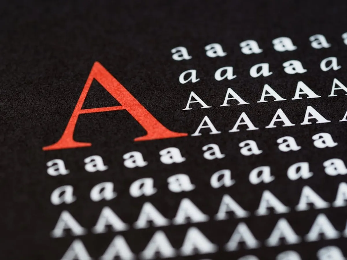
Effective typography is not merely an aesthetic choice; it is a foundational element for user experience, content comprehension, and ultimately, conversion rates on any digital platform. For beginners in SEO, marketing, or site ownership, understanding typography basics means recognizing its direct impact on how visitors perceive and engage with content. Poor typographic choices can increase bounce rates, diminish perceived credibility, and hinder calls to action, regardless of the quality of the underlying content or SEO optimization. Mastering these fundamentals ensures that your site’s visual language supports its commercial objectives, making information accessible and enjoyable for every user.
Distinguishing Typefaces and Fonts
The terms "typeface" and "font" are often used interchangeably, but they represent distinct concepts critical for precise typographic communication. A typeface refers to the design of the letters, numbers, and symbols—its overall visual style. Examples include Arial, Georgia, or Open Sans. It encompasses the entire family of designs, irrespective of size, weight, or style. Think of a typeface as the broader artistic concept, like a specific painting style.
A font, conversely, is the specific implementation of a typeface at a particular size, weight, and style. For instance, "Arial Bold 12pt" is a font, as is "Georgia Italic 16px." In digital contexts, a font file (e.g.,.woff2,.ttf) contains the instructions for rendering a specific typeface variant. Understanding this distinction helps in discussions about design systems and web development, where precise terminology ensures clarity when selecting and implementing text styles.
Serif vs. Sans-serif Typefaces
The primary classification of typefaces for web design involves serif and sans-serif styles, each carrying distinct visual properties and historical associations. Serif typefaces feature small decorative strokes, or "serifs," extending from the ends of characters. Historically, serifs aided readability in print by guiding the eye along lines of text. Common serif typefaces include Times New Roman, Georgia, and Playfair Display. They often convey a sense of tradition, authority, and elegance, making them suitable for formal content, headlines, or brands aiming for a classic aesthetic.
Sans-serif typefaces, meaning "without serifs," lack these decorative strokes, resulting in cleaner, more minimalist letterforms. Examples include Arial, Helvetica, and Open Sans. Their straightforward design often translates to better readability on digital screens, where pixel density can sometimes obscure fine serif details. Sans-serifs are frequently chosen for body text on websites, user interfaces, and brands seeking a modern, approachable, or technological image. The choice between serif and sans-serif should align with content type, brand identity, and target audience expectations for legibility on various devices.
Essential Typographic Controls for Readability
Beyond typeface selection, several key typographic controls directly influence the readability and visual comfort of your web content. Adjusting these elements strategically ensures that information is consumed efficiently, reducing user fatigue and improving engagement.
Font Size and Hierarchy
Font size dictates the physical dimensions of your text. For web content, optimal body text size typically ranges from 16px to 20px, depending on the typeface and target audience. Larger sizes improve accessibility for users with visual impairments and enhance readability on high-resolution displays. Headings (H1, H2, H3, etc.) require progressively larger sizes to establish a clear visual hierarchy, guiding the reader through the content structure. This hierarchy is not just aesthetic; it signals importance and relationships between sections, aiding scannability and comprehension. Responsive design principles necessitate fluid font sizing, often using relative units like em, rem, or viewport units (vw) to scale text appropriately across different screen sizes.
Line Height (Leading)
Line height, also known as leading, refers to the vertical spacing between lines of text. Adequate line height is crucial for readability, preventing lines from appearing cramped or overlapping. A general guideline for body text on the web is to set line height at 1.5 to 1.8 times the font size. For example, a 16px font often benefits from a line height of 24px to 28px. Insufficient line height makes text dense and difficult to track, while excessive line height can break the visual flow, making text appear disconnected. Adjusting line height impacts the overall 'color' or density of a text block, contributing to the page's visual balance.
Letter Spacing (Tracking) and Word Spacing
Letter spacing, or tracking, adjusts the uniform horizontal space between all characters in a block of text. While typically left at default for body text, subtle adjustments can improve legibility for headlines or specific display text. Slightly increasing tracking for all-caps text, for instance, can prevent it from feeling too dense. Conversely, decreasing tracking for very large headlines might create a more cohesive visual unit. Word spacing controls the horizontal space between words. Both tracking and word spacing are fine-tuning adjustments that, when applied judiciously, can enhance visual harmony without drawing attention to themselves.
Line Length (Measure)
The optimal line length, or measure, for comfortable reading on the web is generally considered to be between 45 and 75 characters per line, including spaces. Lines that are too short force the eye to jump frequently, disrupting reading rhythm. Lines that are too long make it difficult for the reader's eye to find the beginning of the next line, leading to fatigue and re-reading. Implementing responsive design techniques, such as using fluid widths for content containers or CSS max-width properties, helps maintain appropriate line lengths across various screen sizes, ensuring consistent readability.
Practical Application: Combining and Optimizing TypeImplementing typographic principles effectively involves more than just selecting a single font. It requires careful consideration of how different typefaces interact and how performance factors influence their delivery.
Typeface Pairing Strategies
Successful typeface pairing creates visual interest and hierarchy without introducing distraction. A common strategy involves combining a serif typeface for headings (to convey authority or elegance) with a sans-serif typeface for body text (for modern readability), or vice-versa. The key is to seek contrast in style, weight, or proportion, but not so much that they clash. Avoid pairing two very similar typefaces, as this can look accidental rather than intentional. Limiting your selection to two, or at most three, distinct typefaces for an entire website maintains visual consistency and reduces cognitive load for the user. One typeface might be a primary display font, another for body text, and a third for accents or specific UI elements.
Web Font Performance
Web fonts, while offering extensive design flexibility, can impact page load times. Each font file represents an additional request and download for the browser. To mitigate this, consider the following:
- Font Formats: Prioritize modern formats like WOFF2, which offer superior compression. Use WOFF and TTF as fallbacks for broader browser support.
- Subset Fonts: If you only use a limited character set (e.g., Latin alphabet without special symbols), subsetting the font to include only necessary glyphs significantly reduces file size.
- Variable Fonts: These single font files can contain an entire range of styles (weights, widths, slants), reducing the number of separate font files needed and offering granular control over typography.
- Font Loading Strategies: Implement strategies like
font-display: swap;in your CSS to prevent invisible text during font loading (FOIT) by displaying a fallback font until the web font is ready.- Self-Hosting vs. CDN: While services like Google Fonts are convenient, self-hosting fonts can offer more control over caching and delivery, potentially improving performance depending on your server setup.
Responsive Typography and Accessibility
Responsive typography ensures that text remains legible and aesthetically pleasing across all devices, from large desktop monitors to small mobile screens. This involves:
- Fluid Font Sizes: Using viewport units (
vw,vh) or a combination ofremand media queries allows font sizes to scale proportionally with the screen size.- Line Length Adjustments: Ensuring content containers adjust width to maintain optimal line lengths (45-75 characters) on all devices.
- Adaptive Line Height: Sometimes, slightly increasing line height on smaller screens can improve readability due to reduced screen real estate.
- Contrast and Color: Always re-verify color contrast ratios when design elements change across breakpoints, especially for text over images or colored backgrounds. Adherence to WCAG standards ensures your content is accessible to the widest possible audience.
Implementing Your Typography Strategy
Developing a coherent typography strategy requires iterative testing and refinement. Begin by defining your brand's voice and target audience, then select typefaces that align with these characteristics. Establish a clear typographic scale for headings, body text, and auxiliary elements, ensuring consistent application across your site. Regularly test readability on various devices and screen sizes, gathering feedback to fine-tune line heights, letter spacing, and overall layout. Performance monitoring for web fonts is also critical; optimize file sizes and loading strategies to prevent any negative impact on user experience or SEO. A well-executed typography strategy elevates content, reinforces brand identity, and enhances the commercial effectiveness of your digital presence.
Frequently Asked Questions
What is the ideal font size for body text on a website?
While there's no single "ideal" size, most experts recommend 16px to 20px for body text on desktop, with responsive adjustments for mobile. Readability also depends on typeface, line height, and contrast.
How many fonts should I use on a single website?
For clarity and performance, it's best to limit your website to two or three distinct typefaces. This typically includes one for headings, one for body text, and possibly a third for accents or specific UI elements.
What is the difference between leading and kerning?
Leading (line height) is the vertical space between lines of text. Kerning is the horizontal space between specific pairs of characters, adjusted for optical balance, typically for headlines or logos.
Why is responsive typography important?
Responsive typography ensures that your text remains legible and visually appealing across all devices and screen sizes, improving user experience, accessibility, and content consumption regardless of how a user accesses your site.