Selecting the right font for event and promotional posters extends beyond aesthetics; it directly impacts message legibility, audience engagement, and brand perception. A poorly chosen typeface can render critical information unreadable from a distance, miscommunicate an event's tone, or fail to capture attention in a competitive visual landscape. Conversely, a strategic font choice reinforces brand identity, communicates professionalism or excitement, and ensures that key details like dates, times, and calls to action are immediately clear and persuasive. This decision is a commercial one, influencing ticket sales, attendance rates, and overall campaign effectiveness. Understanding the practical attributes of various typefaces—from their visual weight and legibility at scale to their emotional resonance and licensing implications—is essential for any marketer or event organizer aiming for maximum impact with their visual communications.
How to Choose Poster Fonts for Maximum Impact
Effective poster font selection hinges on several practical considerations, moving beyond mere visual preference to address functional requirements and strategic objectives. Prioritizing these factors ensures your promotional materials perform as intended:
- Legibility at a Distance: Posters are often viewed from several feet away. Fonts with clear letterforms, distinct character shapes, and sufficient stroke contrast maintain readability from afar. Avoid overly thin, highly decorative, or tightly spaced typefaces for primary headlines.
- Emotional Resonance and Brand Alignment: Fonts carry inherent moods. A sleek sans-serif conveys modernity or professionalism, while a script might suggest elegance or informality. Align the font's character with your event's theme, target audience, and existing brand guidelines to ensure a cohesive message.
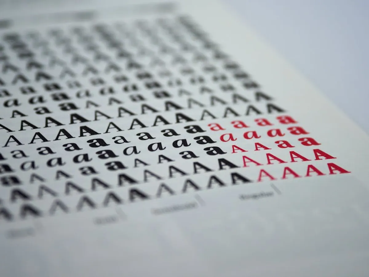
- Hierarchy and Versatility: A single poster often requires multiple levels of information. Select a font family with a broad range of weights (light, regular, bold, black) and styles (italic) to establish a clear visual hierarchy between headlines, subheadings, and body text. This allows for emphasis without introducing too many conflicting typefaces.
- Scalability and Reproduction Quality: Ensure the font renders cleanly at large sizes without pixelation or distortion. Test how it appears in different print formats and digital displays. Vector-based fonts (OpenType, TrueType) are generally preferred for their scalability.
- Licensing: Commercial use of fonts requires proper licensing. Many high-quality fonts are available through subscription services, one-time purchase, or are open-source (e.g., Google Fonts). Verify the license terms for print, web, and merchandise use to avoid legal complications.
- Uniqueness vs. Familiarity: While distinctiveness can help a poster stand out, overly obscure or experimental fonts can hinder legibility. Balance a unique choice with a degree of familiarity to ensure rapid comprehension.
1. Bebas Neue
Bebas Neue is a condensed sans-serif typeface known for its striking uppercase letterforms and clean, geometric lines. Originally designed by Ryoichi Tsunekawa, its tall x-height and narrow width make it exceptionally efficient in terms of horizontal space, allowing for prominent headlines without consuming excessive real estate. This font projects a modern, assertive, and direct character, making it a staple for impactful declarations.
Best for: Event titles, promotional headlines, exhibition banners, film posters, sports event branding, and any application requiring a strong, space-efficient visual statement.
Pros: Excellent legibility at large sizes; strong visual presence commands attention; efficient use of horizontal space; available in multiple weights (Thin, Light, Book, Regular, Bold) for hierarchical flexibility; free for commercial use.
Cons: All-caps design limits versatility for body text or mixed-case applications; can appear aggressive or overly stark if not balanced with softer elements; common usage means it may lack uniqueness if not paired distinctively.
Verdict: A highly effective, no-nonsense choice for primary messaging where impact and conciseness are paramount. Its robust presence ensures headlines cut through visual clutter.
2. Montserrat
Montserrat is a geometric sans-serif inspired by old posters and signs from the traditional Montserrat neighborhood of Buenos Aires. Designed by Julieta Ulanovsky, it offers a clean, contemporary aesthetic with a wide range of weights and styles. Its balanced proportions and open forms contribute to high legibility, making it a versatile workhorse for both display and smaller text applications. It conveys a sense of approachable modernism.
Best for: Corporate event posters, tech conferences, cultural festivals, educational workshops, and any promotional material requiring a clean, professional, and highly readable typeface.
Pros: Extensive family with 18 weights (Thin to Black, with italics) provides robust hierarchical control; excellent legibility across various sizes and mediums; strong web font support; free for commercial use via Google Fonts; versatile for both headlines and body copy.
Cons: Its popularity can make it feel ubiquitous, potentially reducing distinctiveness; geometric forms may lack the warmth or personality required for highly informal or artistic events.
Verdict: A reliable, highly adaptable font family that delivers professional clarity and modern appeal. Its extensive weight range makes it a powerful asset for complex poster layouts.
3. Oswald
Oswald is a classic sans-serif typeface re-drawn and re-digitized by Vernon Adams, designed to be used as a web font. It retains the condensed, bold style of the original ‘Alternate Gothic’ typefaces, making it suitable for headlines and display text. Its tall, narrow structure allows for significant visual impact in limited space, similar to Bebas Neue, but often with slightly more traditional proportions. Oswald communicates strength and directness.
Best for: News-related events, promotional offers, sales posters, sporting events, and any communication requiring a direct, authoritative headline.
Pros: Strong, condensed form creates immediate visual impact; good legibility for headlines and subheadings; multiple weights (Light, Regular, Medium, Semi-Bold, Bold) for varied emphasis; free for commercial use through Google Fonts.
Cons: Primarily designed for headlines and display, less suitable for extended body text; condensed nature can reduce readability slightly at very small sizes; widely used, which can diminish unique branding opportunities.
Verdict: An effective choice for creating bold, space-efficient headlines that demand attention. Its historical roots lend a sense of established authority to promotional materials.
4. Lato
Lato, meaning "summer" in Polish, is a semi-rounded humanist sans-serif typeface designed by Łukasz Dziedzic. It balances warmth with professionalism, featuring semi-rounded details that give it a friendly feel without sacrificing clarity. Its diverse range of weights ensures versatility for both display and text, making it a highly adaptable option for various promotional contexts. Lato projects an approachable yet serious demeanor.
Best for: Community events, educational seminars, health and wellness promotions, family-friendly festivals, and corporate communications seeking a warm, professional tone.
Pros: Extensive family with 10 weights (Hairline to Black, with italics) provides excellent hierarchical control; high legibility for both headlines and body text; friendly and approachable aesthetic; free for commercial use via Google Fonts; strong performance in both print and digital.
Cons: Its subtle humanist qualities might not be impactful enough for highly aggressive or edgy promotional campaigns; widespread use can sometimes lead to a generic feel.
Verdict: A highly versatile and legible font that excels in conveying a friendly yet professional message. Ideal for posters that need to inform and engage without being overly formal.
5. Open Sans
Open Sans is a humanist sans-serif typeface designed by Steve Matteson. Its open forms and neutral, yet friendly appearance make it exceptionally readable across print, web, and mobile interfaces. With a comprehensive character set and a wide range of weights, Open Sans is engineered for maximum legibility and versatility, serving as a reliable choice for both display and extensive body copy. It communicates clarity and trustworthiness.
Best for: Informational posters, corporate events, workshops, public service announcements, and any promotional material where clarity and universal readability are paramount.
Pros: Extremely high legibility even at small sizes; extensive family with 10 weights (Light to ExtraBold, with italics) for robust typographic hierarchy; wide character set supporting multiple languages; free for commercial use via Google Fonts; neutral aesthetic adapts well to diverse branding.
Cons: Its ubiquity can make it appear uninspired or lack distinct personality for campaigns aiming for a highly unique visual identity; its neutrality may not evoke strong emotional responses.
Verdict: The ultimate workhorse font for ensuring clear, accessible communication on any poster. While not flashy, its reliability and legibility are unmatched for conveying essential information.
6. Impact
Impact is a heavy, condensed sans-serif typeface known for its extremely bold weight and tight letter spacing. Designed by Geoffrey Lee, its primary purpose is to create maximum visual "impact" (as its name suggests) in headlines and short bursts of text. The thick strokes and compressed forms make it instantly recognizable and highly attention-grabbing, though its utility is confined almost exclusively to display purposes.
Best for: Urgent announcements, sale promotions, protest posters, bold event titles, and any situation where a message must be seen and understood immediately.
Pros: Unparalleled visual impact and immediate attention-grabbing quality; excellent legibility for short, bold headlines from a distance; universally recognized for its strong presence; widely available on most systems.
Cons: Only available in one weight, limiting hierarchical options within the font itself; extremely poor for body text due to its condensed, heavy nature; overuse can lead to a dated or aggressive appearance; lack of versatility beyond headlines.
Verdict: A specialized tool for creating undeniable visual emphasis. Use sparingly and strategically for primary headlines that require maximum punch, but avoid for any other text.
7. Playfair Display
Playfair Display is a high-contrast serif typeface inspired by the typefaces of John Baskerville and the transitional types of the late 18th century. It features delicate hairlines and strong thick strokes, giving it an elegant and sophisticated appearance. This font is primarily designed for display use, particularly in larger sizes where its intricate details and dramatic contrast can be fully appreciated. It evokes luxury, tradition, and artistry.
Best for: Cultural events, art exhibitions, gala dinners, luxury product launches, theatre productions, and any poster aiming for an elegant, refined, or classical aesthetic.
Pros: High aesthetic appeal, conveying sophistication and elegance; strong contrast creates visual interest and distinctiveness; available in multiple weights (Regular, Bold, Black, with italics) for nuanced display; free for commercial use via Google Fonts.
Cons: Delicate hairlines can become difficult to read at smaller sizes or in low-resolution print; high contrast can cause legibility issues if used for extended body text; may not suit modern, minimalist, or highly energetic event themes.
Verdict: An excellent choice for creating visually rich and elegant headlines that elevate the perceived value and sophistication of an event. Best paired with a clean sans-serif for supporting text.
8. Merriweather
Merriweather is a robust serif typeface designed specifically for screens, prioritizing readability. Its large x-height, slightly condensed letterforms, and sturdy serifs ensure clarity even at small sizes, making it an excellent choice for both display and body text. While optimized for digital, its strong construction translates well to print, offering a sense of stability and traditional trustworthiness. It presents as authoritative yet approachable.
Best for: Educational conferences, literary events, historical exhibitions, institutional announcements, and any poster requiring a legible, authoritative, and classic serif presence.
Pros: Exceptional legibility for both headlines and body text; robust construction ensures clarity in various media; extensive family with 8 weights (Light to Black, with italics) for comprehensive hierarchy; free for commercial use via Google Fonts.
Cons: Its primary focus on readability might make it less visually dynamic for highly creative or attention-seeking headline needs; traditional aesthetic may not align with ultra-modern or avant-garde event themes.
Verdict: A highly dependable serif font for posters that prioritize clear, comfortable reading, especially for events with substantial informational content. It offers a sophisticated alternative to sans-serif dominance.
9. Lobster
Lobster is a bold, connected script typeface designed by Pablo Impallari. It features a continuous, flowing style that mimics hand-lettering, giving it a warm, retro, and friendly appeal. Its distinctive ligatures and stylistic alternates contribute to its organic, personalized feel, making it stand out from more formal or geometric typefaces. Lobster communicates a playful, nostalgic, or artisanal vibe.
Best for: Food festivals, craft fairs, vintage markets, casual community gatherings, retro-themed parties, and any event aiming for a handcrafted or informal aesthetic.
Pros: Highly distinctive and attention-grabbing; conveys a friendly, warm, and personalized tone; automatic ligatures enhance its authentic script appearance; free for commercial use via Google Fonts.
Cons: Legibility significantly decreases at smaller sizes, making it unsuitable for body text; overuse can make it appear generic or cliché; not appropriate for formal, corporate, or serious event themes; limited to a single weight.
Verdict: An excellent choice for adding a touch of personality and warmth to headlines or short phrases on posters. Use strategically as a display accent rather than for extensive text to maintain readability.
10. Arvo
Arvo is a geometric slab-serif typeface designed by Anton Koovit. Its sturdy, block-like serifs and clean, monolinear construction give it a strong, contemporary, and somewhat technical appearance. Arvo is known for its excellent readability, making it suitable for both display and text applications. It projects a sense of reliability, modernity, and a no-nonsense attitude, often associated with tech or industrial aesthetics.
Best for: Tech conferences, design workshops, architectural exhibitions, industrial trade shows, and any event needing a modern, robust, and clear visual identity.
Pros: Strong and distinctive slab-serif presence; excellent legibility for both headlines and body text; available in four styles (Regular, Italic, Bold, Bold Italic) for good hierarchical flexibility; free for commercial use via Google Fonts.
Cons: Its geometric and sturdy nature might be too rigid or cold for events requiring warmth, elegance, or informality; less visually dynamic than some display-specific fonts for pure attention-grabbing.
Verdict: A highly functional and stylish slab-serif that provides a modern, grounded feel. Ideal for posters that need to convey reliability, innovation, and clear information with a contemporary edge.
11. Raleway
Raleway is an elegant sans-serif typeface initially designed by Matt McInerney as a single thin weight, then expanded into a nine-weight family by multiple designers. It features distinctive ligatures and a refined aesthetic, often used for display purposes due to its sophisticated character. Its clean lines and subtle humanist touches make it versatile for both professional and creative contexts, conveying a sense of understated luxury or thoughtful design.
Best for: Design expos, fashion events, luxury brand promotions, art gallery openings, and any poster aiming for a clean, elegant, and modern aesthetic with a touch of distinction. This clean, elegant, and modern aesthetic also makes it a strong choice for the best fonts for invitations and posters that need to stand out.
Pros: Extensive family with 18 weights (Thin to Black, with italics) offers precise hierarchical control; distinctive ligatures add a touch of elegance; high legibility for both display and body text; free for commercial use via Google Fonts.
Cons: Its elegance might be perceived as too delicate for highly aggressive or high-impact campaigns; can appear somewhat formal, potentially clashing with very casual event themes; some of its more decorative ligatures might be distracting in dense body text.
Verdict: A sophisticated and versatile sans-serif that excels in conveying elegance and modernity. It provides a refined alternative to more common sans-serifs, suitable for premium or design-focused events.
12. Source Sans Pro
Source Sans Pro is Adobe's first open-source typeface, designed by Paul D. Hunt. It is a humanist sans-serif with a neutral yet friendly appearance, specifically optimized for user interfaces and digital environments. Its clear, legible forms and generous x-height ensure excellent readability across various sizes and resolutions, making it a reliable choice for both display and extended text. It projects professionalism, clarity, and efficiency.
Best for: Professional seminars, software launches, tech industry events, corporate communications, and any poster requiring a clean, highly legible, and universally accessible typeface.
Pros: Comprehensive family with 12 weights (ExtraLight to Black, with italics) for extensive hierarchical options; exceptional legibility across digital and print media; broad language support; free for commercial use via Google Fonts; neutral aesthetic ensures broad applicability.
Cons: Its primary focus on neutrality and readability means it lacks a strong, unique personality for highly distinctive branding; can be perceived as somewhat generic due to its widespread use in digital interfaces.
Verdict: An outstanding choice for ensuring maximum readability and professionalism on event posters. It's a pragmatic, high-performance font for communicating essential information clearly and efficiently.
Optimizing Font Choices for Poster Success
Selecting the right fonts is only the first step. To ensure your event and promotional posters achieve their commercial objectives, consider these implementation strategies:
- Font Pairing: Limit your poster to two or, at most, three complementary fonts. A common strategy involves pairing a strong display font for headlines with a highly legible sans-serif or serif for subheadings and body text. Ensure contrast in style, weight, or classification to create visual interest without clutter.
- Size and Scale Testing: Print test versions of your poster at various scales and view them from different distances. What looks good on a screen can be unreadable on a large format poster or billboard. Pay close attention to headline impact and body text legibility.
- Color Contrast: The chosen font must have sufficient contrast against its background color to ensure readability, especially in varying lighting conditions. High contrast is critical for accessibility and rapid comprehension.
- Consistency Across Channels: Maintain font consistency across all promotional materials—digital ads, social media graphics, flyers, and event signage. This reinforces brand identity and creates a cohesive campaign experience.
- Call to Action Prominence: Ensure your call to action (e.g., "Buy Tickets Now," "Register Here") stands out using font size, weight, or a distinct, complementary display font. Its clarity and visibility are directly tied to conversion rates.
Frequently Asked Questions About Poster Fonts
What is the ideal number of fonts to use on a poster?
For maximum clarity and visual impact, limit your poster to two distinct font families. One for headlines and primary messaging, and another for supporting text. Using more than three fonts typically leads to a cluttered and unprofessional appearance, hindering readability.
Should I use a serif or sans-serif font for event posters?
The choice between serif and sans-serif depends on the event's tone and target audience. Sans-serifs (like Montserrat, Open Sans) generally convey modernity, simplicity, and are highly legible at a distance. Serifs (like Playfair Display, Merriweather) often evoke tradition, elegance, or authority. For maximum versatility, many posters effectively combine a sans-serif headline with a serif body text, or vice-versa, to create visual interest and hierarchy.
How do I ensure my poster font is readable from a distance?
Prioritize fonts with clear, open letterforms and sufficient stroke weight. Avoid thin, highly decorative, or tightly spaced fonts for primary information. Test print your poster at actual size and view it from the typical distance your audience would. Ensure strong color contrast between the text and background. Large x-heights and generous counter spaces within letters also aid distant readability.
Are free fonts suitable for commercial event posters?
Yes, many high-quality fonts are available for free commercial use, particularly through platforms like Google Fonts. Always