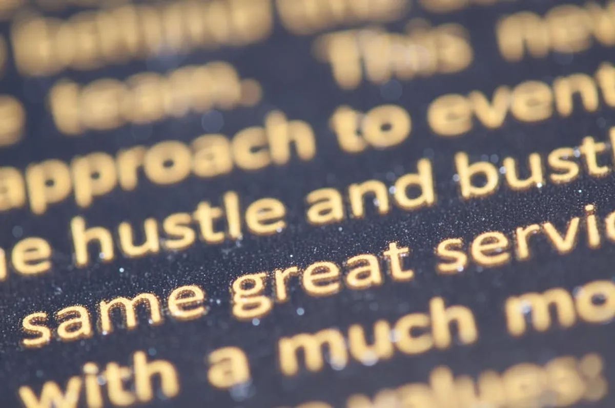
The Montserrat font, a geometric sans-serif, has established itself as a staple in modern digital and print design. Its origin, inspired by old posters and signs from the Montserrat neighborhood of Buenos Aires, imbues it with a distinct urban yet timeless quality. For designers, marketers, and site owners, understanding Montserrat's characteristics and optimal applications is crucial for effective visual communication. This guide details where Montserrat excels and how to pair it strategically, ensuring your typographic choices align with brand objectives and enhance readability across diverse platforms.
Understanding Montserrat's Design Principles
Geometric Foundations and Urban Inspiration
Montserrat's design is rooted in the geometric sans-serif tradition, characterized by clean lines, open forms, and a strong, consistent baseline. Its letterforms are constructed with a mathematical precision that contributes to its modern, structured appearance. The inspiration drawn from early 20th-century urban signage lends it an authentic, approachable feel, preventing it from appearing overly sterile despite its geometric nature. This balance makes Montserrat suitable for conveying both professionalism and contemporary appeal.
Readability and Versatility
A key attribute of Montserrat is its high readability across various sizes and resolutions. The generous x-height, open counters, and well-proportioned ascenders and descenders ensure clarity, particularly on screens. The font family offers an extensive range of weights, from Thin to Black, including corresponding italics for each. This broad spectrum provides significant typographic flexibility, allowing designers to establish clear visual hierarchy and distinction between headlines, subheadings, and body text using a single font family.
Optimal Applications for Montserrat
Digital Interfaces and Web Design
Montserrat's clarity and modern aesthetic make it a prime choice for web and application interfaces. Its legibility on digital displays, coupled with its availability via Google Fonts, ensures consistent rendering and efficient loading times. The various weights can be deployed to differentiate navigation elements, button labels, and content blocks without introducing visual clutter.
Best for:
- Website navigation menus and calls-to-action
- Mobile application interfaces and system text
- Digital advertisements and social media graphics
- E-commerce product descriptions and pricing tables
Branding and Logo Design
For brands aiming for a contemporary, clean, and trustworthy image, Montserrat offers a robust solution. Its geometric precision and balanced proportions translate well into logotypes and brand marks. The font can anchor a brand's visual identity, providing a foundation that feels both established and forward-thinking. Its neutrality allows it to blend with various brand color palettes and imagery.
Best for: Tech startups, corporate branding, modern lifestyle brands, educational institutions.
Editorial and Marketing Collateral
Beyond digital, Montserrat performs effectively in print materials. Its legibility ensures that brochures, reports, presentations, and print advertisements maintain clarity and a professional appearance. The font's range of weights allows for dynamic layouts, where headlines can command attention while body text remains effortlessly readable.
Best for: Annual reports, marketing brochures, business cards, presentation slides, conference materials.
Pro Tip: When using Montserrat for hierarchy, leverage its diverse weight range. For instance, employ 'Montserrat Bold' or 'ExtraBold' for main headlines, 'Montserrat SemiBold' for subheadings, and 'Montserrat Regular' or 'Light' for body text. This creates visual interest and guides the reader without needing to introduce a second font for basic structure.
Effective Font Pairings with Montserrat
Pairing Montserrat with other fonts can enhance visual appeal and reinforce specific brand attributes. The goal is to create contrast or complementarity that supports the overall design objective.
Contrasting Serif Fonts
To introduce a sense of tradition, warmth, or classic elegance, pairing Montserrat with a well-chosen serif font can be highly effective. The geometric sans-serif provides a modern anchor, while the serif adds character and depth.
Pairing examples and justification:
- Playfair Display: Its high contrast and delicate serifs offer a sophisticated, editorial counterpoint to Montserrat's clean lines. Ideal for luxury brands or content-heavy sites where headlines need gravitas.
- Lora: A well-balanced serif with calligraphic roots, Lora provides a softer, more humanist touch. It pairs well for body text, adding warmth and improving long-form reading comfort when Montserrat is used for headings.
- Merriweather: Designed specifically for screens, Merriweather offers excellent readability in body text. Its sturdy serifs and open forms create a pleasant visual texture against Montserrat's geometric precision, suitable for blogs and news sites.
Complementary Sans-Serif Fonts
For a consistently modern and minimalist aesthetic, pairing Montserrat with another sans-serif can work, provided there's enough visual distinction or a specific functional purpose. This approach often relies on subtle differences in proportion, x-height, or humanist elements.
Pairing examples and justification:
- Open Sans: A highly versatile humanist sans-serif, Open Sans offers a slightly warmer, more organic feel than Montserrat. It pairs well for body text, providing a subtle contrast in character while maintaining a clean, contemporary look.
- Lato: With its semi-rounded details, Lato offers a friendly and approachable alternative. When Montserrat handles headlines, Lato can serve as a readable and less formal body text, suitable for community-focused platforms.
Display Fonts for Impact
When a specific headline or call-out requires significant visual impact, a more decorative or bold display font can be used sparingly, with Montserrat handling the majority of the text. This creates a clear hierarchy and prevents the design from becoming overwhelmed.
Pairing examples and justification:
- Oswald: A condensed sans-serif, Oswald delivers a strong, impactful presence for headlines. Its narrower proportions provide a distinct visual break from Montserrat, making it suitable for titles that need to stand out without competing for attention in body copy.
- Anton: An ultra-bold display sans-serif, Anton is designed for maximum impact in large sizes. It can be used for single-word calls to action or very short, punchy headlines, letting Montserrat manage all other typographic elements for clarity.
Implementing Montserrat for SEO and Accessibility
From an SEO perspective, using Montserrat via Google Fonts ensures efficient loading and consistent rendering across devices, which contributes to a positive user experience—a factor Google considers. Its open-source nature also means no licensing costs, simplifying deployment. For accessibility, Montserrat's clear letterforms, generous spacing, and availability in various weights aid legibility, particularly when combined with appropriate line height and sufficient color contrast. These attributes help ensure content is accessible to a wider audience, including those with visual impairments.
Strategic Typography Decisions
Selecting Montserrat for your project involves more than aesthetic preference; it's a strategic decision. Its geometric clarity and wide weight range offer a foundation for robust visual communication. Consider your brand's voice—is it modern, professional, approachable, or authoritative? Montserrat can adapt to these nuances, especially when paired thoughtfully. Evaluate your primary medium, whether web, print, or both, as Montserrat's design performs consistently across these platforms. By understanding its strengths and how to leverage its versatility, you can make informed typographic choices that resonate with your audience and reinforce your brand's message.
Frequently Asked Questions
Is Montserrat free to use?
Yes, Montserrat is an open-source font available through Google Fonts, meaning it is free to use for both personal and commercial projects without any licensing fees.
What type of font is Montserrat?
Montserrat is classified as a geometric sans-serif typeface. This means its letterforms are constructed with clean lines and geometric shapes, giving it a modern and structured appearance.
Is Montserrat good for body text?
Yes, Montserrat is generally considered good for body text, especially its Regular and Light weights. Its high legibility, generous x-height, and open letterforms ensure comfortable reading on screens and in print, provided adequate line height and letter spacing are applied.
How does Montserrat compare to similar fonts like Open Sans or Lato?
While all three are popular sans-serifs, Montserrat is more strictly geometric, offering a clean, modern, and structured feel. Open Sans is a humanist sans-serif, providing a slightly warmer and more organic appearance. Lato, also a humanist sans-serif, features semi-rounded details that give it a friendly and approachable character. Each offers distinct nuances in tone and aesthetic, making the choice dependent on specific project requirements.